
For many small businesses, having an online storefront or website that works and displays well on desktops is simply enough. Therefore, it isn’t surprising that most small businesses hardly give any thought to their websites being optimized for mobile devices.
Unfortunately, the world isn’t going to wait until they come around to that. In fact, this is even more important seeing as more people are accessing websites primarily through their mobile devices. Studies carried out by BIA/Kelsey indicate that almost 30% of all search engine queries are carried out on mobile devices (that’s almost 150 million search queries per day). These are incredible numbers. And guess how many of the website listings are properly optimized for mobile devices, about 1 in every 10 sites.
Little wonder that when confronted about the best mobile site design option, most site and small business owners have no idea of what to choose or which is best for them. This is why you need to know the difference in order to make an informed choice. There are two major mobile options for your website. These are:
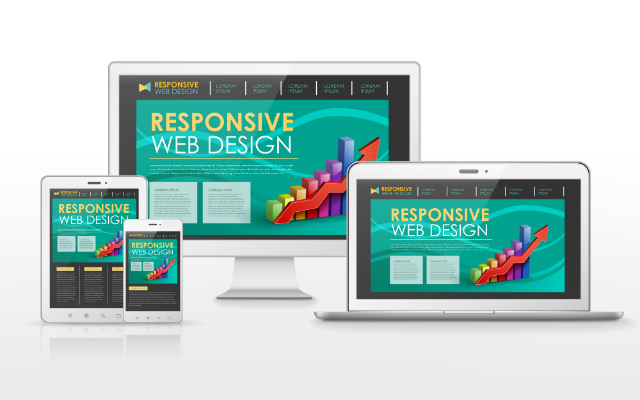
A website with responsive design is one that adapts to any screen it is accessed from. Websites like this render well on all devices regardless of their size. Therefore, if you were to visit the website on a mobile device, you won’t need to scroll horizontally or deal with jumbled text –something that is common with websites only developed for desktop devices.
You would be able to view the website as comfortably as when you visit it from a laptop or desktop computer. This is even more important seeing as most visitors don’t have the time or patience to scroll around or try to figure out how your website works on their mobile devices.

Separately hosted mobile sites (called “m” sites because their domains are usually in the form of m.xyz.com) are mobile versions of standard desktop websites. These don’t automatically render on devices.
On arriving at the website on their mobile devices, visitors are usually asked to choose between a mobile version and desktop version. While this may initially look like the “easier” route to take, its long term running and maintenance costs can be quite substantial and will far outweigh any costs incurred during the development of a website based on responsive design.
Far as we’re concerned, the better of the two is the responsive design. Here’s why:
Websites built using responsive design are simply intuitive. There’s no need to choose between any options as it automatically renders with full functionality on all mobile devices.
Even better is the maintenance costs and requirements: There’s basically none. This means you won’t have to pay for separate hosting or go in and manually input any updates made on the main website, which can become tedious very fast if you update the site frequently. Everything automatically updates when any update is done on the main site. Think of it as a smaller and more compact but fully functional version of the large site on mobile devices.
Also, Google loves sites with responsive designs because it makes their job of providing only the most relevant and most convenient search listings easier. And if you’re forward thinking, a responsive design website is surely the way to go. As mobiles evolve in the future, so will the site. Basically, there’ll be no need to do a website overhaul just because mobile devices have changed or evolved.
Separately hosted mobile sites don’t have any of these advantages other than the fact that it’s just a mobile version; and even then, it’s usually a highly limited version of the main site.
Now that you know this, you can hopefully, make an informed choice about what kind of website you want, to keep your visitors happy and kick your competitors to the curb while reaping the benefits of your new responsive design-based website.


Level 1, 530 Little Collins Street, Melbourne VIC 3000, Australia | 1300 887 151
Level 2, 50 York Street, Sydney 2000 | 1300 788 679
Level 1, The Realm, 18 National Circuit, Barton Canberra ACT 2600 Australia | 1300 765 708
Level 1, 16 McDougall Street, Milton 4064 | 1300 765 709
220 Varsity Parade, Varsity Lakes QLD Australia 4227 | 1300 887 804
Level 1, Paspalis Centrepoint, 48-50 Smith Street, Darwin NT 0800 Australia | 1300 889 815
Level 18, Central Park. 152-158 St Georges Terrace Perth, WA 6000 Australia | 1300 550 753
Level 3, 97 Pirie Street, Adelaide 5000 | 1300 669 895
Level 6 Reserve Bank Building, 111 Macquarie Street, Hobart TAS 7000, Australia | 1300 885 870


