
It’s 2014 and where the internet is concerned, the world is flat again.
Wherever you look on the net you will find design styles leaning towards flat designs, with elements, tutorials and examples springing up everywhere.
But just what is this new craze all about? And why care at all?
It would seem that flat design is both a trend-setter as well as a new way to better the user experience. So let’s consider why that is, and look at a few resources that you can use to move your site or sites into the flat world.

Although flat designs is nothing new, it hit its stride when Windows 8 launched its ‘Metro’ interface, changing the trend from gradients and overwhelming textures to straight-forward shapes, strong colours and ‘flat’ elements: ergo the name.
This paradigm shift in design also brought about more white space and larger letters — the idea being that user interfaces need to be easier to browse on various devices.
As such, flat design also serves as an antithesis to skeumorphism, meaning digitized graphics that take their inspiration from real-life by giving them almost a three-dimensional look.
Apple took the lead on skeumorphism by putting shadows and gradients on their elements that made them almost pop out of the screen. This looked great for a while, but by now the users have become weary of it because it’s easier to type it out instead of clicking a fancily shaded button.

One of the best design concepts for a website is to separate it into blocks of content, a notion that is native to the flat design.
It has been proven that there is a definite difference in conversion rates when using a simpler and more clearly mapped out site versus a design-overloaded site. However, that doesn’t mean you need to switch your site to a flat design — it really isn’t necessary for all sites.
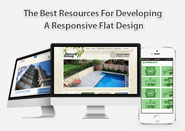
Flat designs are indeed very adaptable to any screen size and look great on mobile devices, responding quite well to any change, hence making flat design the ultimate responsive design.
Already there is an overwhelming selection of resources out there that will help anyone create a flat web design. Here we present a small list of a few of the more outstanding ones.
Originating from Dribble, this wireframe design can help you develop a flat design following the most recommended design rules.
Originating at DesignShock, this nifty collection contains vector icons, 500+ elements, vector PSD and 7 main PSD files in 30 different colors. Whatever you could need is available, ranging from error message files and contact details to music playlists. There are both a free and a commercial version available.
Furatto is an OS framework that is responsive using flat elements.
Furatto includes design elements for basic templates, carousel slideshows, landing pages and a dashboard, to name just a few. Its fantastic flexibility and simple user interface gives you the option to create style looks instantly.
The idea behind Responsive Web CSS is to quickly prototype your design on various devices, to understand how it will look. This can save you hours of frustrating guess-work to get layouts just right.
Bootstrap is Twitter’s entry in the flat world and one of the most popular choices for putting together quick responsive designs.
One of the pivotal points in flat designs are the simple ‘flat’ icons and button elements. A lot are available for free.
Dribble created a big variety of interface elements in three colour schemes: anything from search boxes, calendars, maps, icons, etc.
This is from Riki Tanone, a gorgeous interface kit. It’s also available as a blog version.
Pixedon has 16 flat-style social media icons available in PSD format.
These are some pixel-perfect colour schemes for flat designs. All you have to do is to cut and paste!


Level 1, 530 Little Collins Street, Melbourne VIC 3000, Australia | 1300 887 151
Level 2, 50 York Street, Sydney 2000 | 1300 788 679
Level 1, The Realm, 18 National Circuit, Barton Canberra ACT 2600 Australia | 1300 765 708
Level 1, 16 McDougall Street, Milton 4064 | 1300 765 709
220 Varsity Parade, Varsity Lakes QLD Australia 4227 | 1300 887 804
Level 1, Paspalis Centrepoint, 48-50 Smith Street, Darwin NT 0800 Australia | 1300 889 815
Level 18, Central Park. 152-158 St Georges Terrace Perth, WA 6000 Australia | 1300 550 753
Level 3, 97 Pirie Street, Adelaide 5000 | 1300 669 895
Level 6 Reserve Bank Building, 111 Macquarie Street, Hobart TAS 7000, Australia | 1300 885 870


