
Web forms are a vital component of most landing pages, although they’re frequently not given the attention they deserve. They’re meant to gather the personal data of your leads, so you are able to move them through your sales funnel. The number of conversions you get will depend on your web form design.
In most cases, visitors to your site will want to spend as little time as possible filling your form fields.
Consequently, brevity will be a primary focus. However, you may also want to consider that longer forms often generate leads that are higher quality.
In the final analysis, web form design is about creating the best possible experience for your users:
If you adhere to the following practices, you are bound to see a noticeable improvement in your conversion rate.

At times, not paying close attention to the fields that are included on a form may result in the loss of many potential clients.
For instance, Expedia, which is a web based travel firm, learned this the hard way. Expedia, had a form with a “company” field directly beneath a “name” field on a form on their site.
Even though the “company” field was optional, it confused many customers who ended up entering the name of their bank in this field.
To make matters worse, they also input their bank address in the “address” field, where their home address was supposed to go. Not surprisingly, processing of credit cards failed since the verification of address was not correct.
This web form confusion caused Expedia to have a reduction in profit of $12 million/year. This problem was only discovered after a careful analysis of analytics data.
The take home message is, don’t make your web forms confusing, or you will risk losing many conversions that would otherwise be successful.
Designers can get better conversions by focusing on the length of their forms. Normally, shorter forms perform better than long forms. In general, site visitors prefer short forms, particularly on mobile devices.
For example, Stay On Search is a web design and marketing business that experimented with forms of varying length on their site.
The initial form that they used had eleven fields. The next form they tried had only four fields. Can you predict which form had the greatest conversion rate? Well, the form with four fields had a 120% higher conversion rate compared to the eleven field form. Interestingly, the quality of the leads did not decline with the shorter form.
Today Stay On Search uses a form that has only three field on their homepage.
Nevertheless, a large body of research does demonstrate that short forms can reduce the quality of your leads.
We suppose the people who take the time to fill out the longer forms are more highly motivated. This suggests that there can be a trade-off between quality and quantity when you reduce the number of fields in your web form.
Therefore, if you want higher-quality leads, longer forms may work better, because people who fill them in may have a greater likelihood of converting.
You may also want to consider using side-by-side captions for your web form fields. This is a better alternative than placing labels above fields, which is done by many designers.
Placing labels above fields makes a web form look longer than it actually is. Therefore, you should avoid this by placing captions adjacent to, and horizontally across from blank fields.
At times it helps to be unique. By being unique, you draw attention and become more memorable. This is also applicable to web forms.
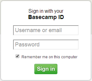
When your competition is using standard forms that all have a similar look and feel, your unusual form can be a welcome change for visitors to your site. For instance, look at the unusual login form on this site: http://www.svn2ftp.com/.
Immediately, the user is captivated by the unorthodox look of this form.
Rather than entering information into a boring, standard form, visitors enter data into fields that look like pages in a notebook. This unexpected look and feel can increase subscribers by itself.

One very obvious aspect of form design is not addressed by some designers. If the information that your users submit in your forms is compromised, your business will take a big hit, from which it may never recover. Therefore, you can’t be overly cautious when safeguarding the personal information of your visitors.
Consequently, it’s good practice to have an SSL certificate that covers your entire domain. Then your visitors will be protected at sign up, and their entire session on your site will also be protected.
This precaution isn’t absolutely necessary, but it can certainly be helpful to protect the personal information of your buyers and leads. It will also make your users feel safer about trusting you with personal information, and hence it can improve conversions.
There’s nothing that will harm your conversions more than web forms that don’t have clear labelling.
Forms without clear labelling will cause your users to become frustrated and result in a bad user experience. They increase the friction within a transaction and hamper conversions.
The format your visitors will use to enter data has to be extremely clear and straightforward. There should be no doubt at all regarding the information that is supposed to be entered in each field.
Leave nothing at all to chance. The inclusion of several extra words adjacent to blank fields can result in a huge difference when you’re trying to get users to input personal information properly.

Even though many people dislike filling out forms, you shouldn’t ignore them. As a matter of fact, that is the exact reason why you need to take some additional time to make your forms as painless as you can for your users.
It’s not overly complex, it only involves using some common sense design principles to be sure that your visitors aren’t immediately turned off by a web form that irritates or frustrates them.
Web forms that don’t adhere to best practices will have an adverse effect upon conversions and user experience. They create increased friction that will decrease your conversions. Employing a little extra effort to ensure that your web forms are designed effectively is sure to pay off in the long run.


Level 1, 530 Little Collins Street, Melbourne VIC 3000, Australia | 1300 887 151
Level 2, 50 York Street, Sydney 2000 | 1300 788 679
Level 1, The Realm, 18 National Circuit, Barton Canberra ACT 2600 Australia | 1300 765 708
Level 1, 16 McDougall Street, Milton 4064 | 1300 765 709
220 Varsity Parade, Varsity Lakes QLD Australia 4227 | 1300 887 804
Level 1, Paspalis Centrepoint, 48-50 Smith Street, Darwin NT 0800 Australia | 1300 889 815
Level 18, Central Park. 152-158 St Georges Terrace Perth, WA 6000 Australia | 1300 550 753
Level 3, 97 Pirie Street, Adelaide 5000 | 1300 669 895
Level 6 Reserve Bank Building, 111 Macquarie Street, Hobart TAS 7000, Australia | 1300 885 870