
Approximately 50% of emails are now viewed on mobile devices. There have been several studies which show that about three-fourths of users will delete an email that does not render well on their accessing device.
If you want your email messages to be read by mobile users, you’ll have to design them so they can be read on mobile devices.

Certainly, the remainder of your emails will be viewed on desktop or laptops that have much larger displays, and usually have email clients that are more capable. Of course, we don’t want to neglect these users either.
The solution for emails that render well on desktops, laptops, tablets, and smartphones is a similar approach as that use for mobile site design, which is responsive design.
Responsive design attempts to provide users with content in a manner that is both visually appealing and functional regardless of the display resolution of their accessing device. The focus is upon providing users with a good experience and this requires us to do some additional work on behalf of our users.
For emails that are optimised for mobile users, responsive designs will usually utilise three capabilities: fluidity, mobile-first design, and media queries.

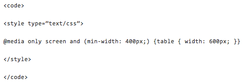
Adding media queries to CSS gives designers the capability to use different styles that are based upon the user’s screen resolution. For instance, a designer is able to adjust the width of an HTML table to 500 pixels for a desktop and 280 pixels for a smartphone.
Media queries are embedded in style sheets. For HTML emails, this will usually mean a media query will be with a style tag in the head of a document. .
Not all email clients on mobile devices have the capability of processing media queries. Therefore, you may want to consider designing your emails for mobile users first, and making use of media queries to adapt them to desktops and laptops. These devices will normally use email clients that have the capability of processing media queries.
This will mean that you will use inline styles in designing for mobile, and media queries that are within the style tags will be utilised to make the layout larger for additional devices. This could eliminate the issue of having to determine which email clients on mobile devices have support for media queries.
When you are designing your HTML email, it may also help to utilise designs that use fluid principles that won’t declare widths specifically, but instead permit designs to fill the space that is available by flowing.
In many instances this will involve specifying widths with percentages as opposed to specifying the pixel number. Fluid layouts may be more difficult to control. Therefore, it is wise to test your emails before you send them out to all your clients.
Media queries, fluid design, and a design approach that considers mobile-first can be used to control almost any aspect of the appearance of HTML emails.
Bearing this concept in mind, we’ll present you with elements that should be made responsive to the accessing device.
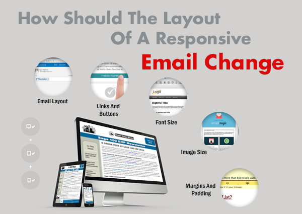
HTML emails that are optimised for mobile should contain only one column, while desktop users will usually be able to read two columns with the most ease.
For mobile devices buttons and links should have a target area, which is finger-friendly, of more than 45 square pixels. Emails for laptops and desktops can have links in a list, because there won’t be any difficulty selecting them using a mouse.
Fonts are required to be much larger for mobile devices than they need to be on larger displays.
In order to fit within the viewing area of accessing devices, images must be resized.
Mobile devices frequently make use of every pixel. Text will frequently go all the way to the edge of the display. Therefore, make sure that you adjust margins and padding for mobile.
Different email clients process HTML templates and styles differently. Therefore, you must have an understanding of the capabilities and limitations of available clients prior to creating an HTML email that is responsive.


Level 1, 530 Little Collins Street, Melbourne VIC 3000, Australia | 1300 887 151
Level 2, 50 York Street, Sydney 2000 | 1300 788 679
Level 1, The Realm, 18 National Circuit, Barton Canberra ACT 2600 Australia | 1300 765 708
Level 1, 16 McDougall Street, Milton 4064 | 1300 765 709
220 Varsity Parade, Varsity Lakes QLD Australia 4227 | 1300 887 804
Level 1, Paspalis Centrepoint, 48-50 Smith Street, Darwin NT 0800 Australia | 1300 889 815
Level 18, Central Park. 152-158 St Georges Terrace Perth, WA 6000 Australia | 1300 550 753
Level 3, 97 Pirie Street, Adelaide 5000 | 1300 669 895
Level 6 Reserve Bank Building, 111 Macquarie Street, Hobart TAS 7000, Australia | 1300 885 870


