
There are many websites that aren’t very mobile friendly, but this year that is rapidly changing. Designing a site that is mobile friendly, is practically a necessity for today’s web designers. Users desire the sites they visit to function seamlessly on laptops, tablets, and smartphones. How are designers going to make this a reality? We will present you with some of the mobile web design trends that are altering the online landscape.
Increased Use Of Responsive Design
The goal of responsive website design is for a site to render well on any type of device, including laptops, desktops, iPad, iPhone, tablets, or smartphones. With responsive design the display resolution of the accessing device is determined and content is loaded accordingly. With visitors accessing sites from mobile devices in increasing numbers, this trend is likely to only grow more popular.
A high proportion of internet users make purchases while they are in transit. With people making purchases from mobile devices in increasing numbers, responsive design eliminates the need for separate HTML and SEO for a mobile site, so consumers are able to access a site and purchase products regardless of the accessing device they are using.
Websites Are Becoming Less Cluttered
In the past, the most desirable site home pages were very busy and action-packed, but not any longer. Designers have come to the realisation that less can be better, particularly on mobile sites. They are accomplishing this with landing pages that are hidden and navigation bars that are shorter. There are some sites that are doing away with the navigation bar completely.
With the use of landing pages that are hidden, visitors that are performing a search on a mobile device will end up on a landing page, rather than the home page of the site, increasing the probability that they will purchase a product or service or find out more about it. Hidden pages can be found in searches, and they assist in decreasing home page clutter. The use of arrows pointing left and right and scrolling bars also increases the usability of mobile sites and they entice visitors to view more content using a touchscreen or a mouse.
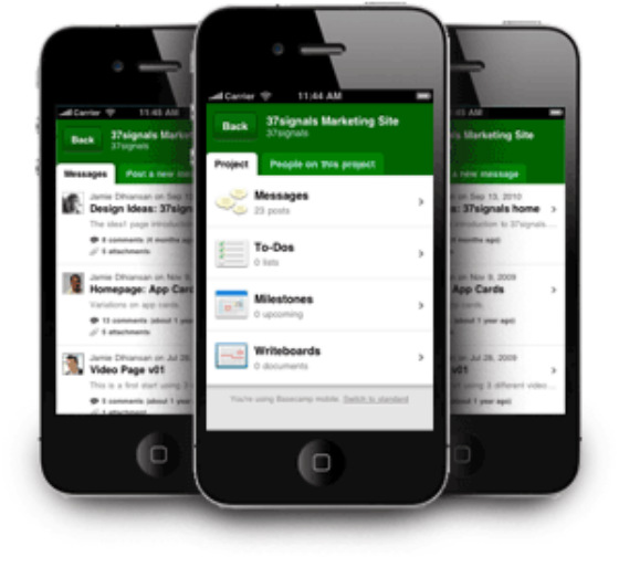
Websites With An App-like Appearance
Instead of just apps, designers are creating websites that look like apps. With Apple offering about 700,000 apps in their store and Google offering 550,000 in their own store called, Google Play, and users of mobile devices downloading them in huge numbers, website designers will obtain a huge audience by designing websites that look like apps, and users will like the familiarity they offer.
Moving Navigation Bars
Using CSS, programmers can create navigation bars that scroll along with users. Although this is not a new concept, these navigation bars give users a very easy way to go to another page on a site quickly. This type of navigation works best when navigation is search or page content driven to provide users with a way of rapidly changing their search criteria or allowing them to click on bars that are scrolling in order to pair down the content they desire.
Flash Is Overtaken By HTML5 And JavaScript
With the additional features available in HTML5, Flash is slowly being replaced. Web designers are increasingly using HTML5 instead of Flash to create sites that engage users and have movement. In addition, since Flash is compiled code, it is not SEO friendly and HTML5 code can be read by search engine crawlers, making it much better for SEO purposes.
Incorporating Larger Images And Photos
Site designers are doing away with smaller images and choosing to display high-resolution images that are larger. With proper design, these images are aesthetically pleasing and give the opportunity for an increasing number of elements in the image.
Quick Response Code Insertion
QR codes are now widely used on sites for calls to action, particularly on mobile sites and users of mobile devices are increasingly scanning them. QR codes are good for coupons, promotions, discounts, and informational purposes. When users see these QR codes they are frequently taking advantage of their offerings.
Increasing Number Of Social Media Sites
In the past most sites would have a Twitter and Facebook badge and nothing more. Today, designers are also incorporating badges from Google Plus, LinkedIn, Digg, Tumblr, Pinterest, StumbleUpon, and more. In addition to leading visitors to social media platforms, designers are also making use of social media on their blog posts, where visitors can easily share the posts on social media sites.
Video Integration
Google searches will nearly always show a couple of YouTube videos in the search results. This is partly due to the fact that Google owns YouTube, however, an additional reason is the scalability to real-life that videos provide.
Site visitors are able to see the way a product functions, take a visual tour, or learn ways to make use of software, and the role of videos in web design is only increasing.
Larger Fonts
Larger font sizes are used increasingly on mobile sites. XHTML and CSS are used to make larger fonts fit on mobile displays, but when desktops, tablets, or laptops are used, larger text, with fonts that are simpler, are increasingly engaging site visitors.
Sans serif is again popular coupled with large text, and designers are increasingly making use of this trend.
Designing for the mobile web:


Level 1, 530 Little Collins Street, Melbourne VIC 3000, Australia | 1300 887 151
Level 2, 50 York Street, Sydney 2000 | 1300 788 679
Level 1, The Realm, 18 National Circuit, Barton Canberra ACT 2600 Australia | 1300 765 708
Level 1, 16 McDougall Street, Milton 4064 | 1300 765 709
220 Varsity Parade, Varsity Lakes QLD Australia 4227 | 1300 887 804
Level 1, Paspalis Centrepoint, 48-50 Smith Street, Darwin NT 0800 Australia | 1300 889 815
Level 18, Central Park. 152-158 St Georges Terrace Perth, WA 6000 Australia | 1300 550 753
Level 3, 97 Pirie Street, Adelaide 5000 | 1300 669 895
Level 6 Reserve Bank Building, 111 Macquarie Street, Hobart TAS 7000, Australia | 1300 885 870


